
Key takeaway
Do not crowd your first screen with every contact widget or rely on a single generic inbox. Match channels to visitor context—forms for scoped briefs, WeCom or WhatsApp for quick chats, email for attachments, and phone for urgent checks—and set clear primary and secondary actions per page zone.
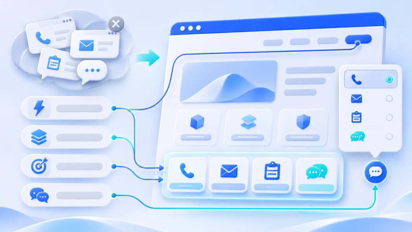
When configuring contact options on a B2B corporate website, companies often fall into one of two extremes. The first is driven by the fear of missing a lead: six floating buttons—landline, mobile, personal chat, enterprise chat, email, and a feedback tab—hug the right edge of the viewport, while an automated chat box pops up ten seconds after page load, covering specification tables and case studies. The second extreme is over-minimalism: the entire site offers nothing but a single generic info@ email in the footer, leaving buyers with a quick scoping question or urgent deadline no practical way to start a conversation.
Phone numbers, business email, structured project consultation forms, and instant messaging (official WhatsApp for international markets, WeCom for domestic China) are not interchangeable duplicates. Each channel serves visitors at a different stage of readiness, carries a different volume of information, and requires a different internal response workflow. A well-structured website matches each of the four channels to the visitor context it handles best, and arranges them across five key page zones with clear primary and secondary hierarchy—without obscuring body text.
What Each of the Four Channels Solves: Visitor Context, Information Load, and Reception Cost
When every contact method is stacked side by side with equal visual weight, visitors have to guess which channel is actually monitored. Defining the operational boundary of each channel is the first step toward a clean layout.
1. Structured Project Consultation Form: For Visitors with an Initial Scope
Once a visitor has reviewed your service pages, solutions, or project case studies and has a concrete initiative in mind—such as redesigning a bilingual website or replacing spreadsheet trackers with a custom business system—they want an organized way to explain their context in one submission.
- Information capacity: High and structured. By collecting essential inputs (name, contact details, company, existing website URL, selected service category, and project overview), a clear form eliminates the first round of basic qualification.
- Internal reception cost: Asynchronous and low-interruption. Submissions land in a private backend inquiry database where administrators review the full context daily before assigning the right owner (for post-submission routing logic, see How Inbound Inquiries Are Automatically Routed to the Right Person).
- Limitation: For an early-stage visitor who only wants to verify a single boundary condition, completing a multi-field form and checking privacy consent feels like too much friction.
2. Instant Messaging (WhatsApp / WeCom): For Quick Mid-Browsing Questions
Many qualified buyers pause mid-page with a narrow question: "Do you work with clients outside Shanghai?" or "Can we talk if we only have a rough scenario and no formal brief yet?" Asking these visitors to write a formal email or fill out a full form often causes them to leave.
- Information capacity: Lowest entry barrier, ideal for two- or three-sentence checks. Once connected, visitors can easily share screenshots or reference URLs. International visitors expect an official WhatsApp link with a pre-filled English message on mobile and a QR code on desktop, while domestic Chinese visitors expect an official WeCom link or QR code.
- Internal reception cost: Requires timely human attention during business hours. Publishing a chat button that goes unanswered for days—or traps users in a bot loop demanding a phone number—erodes trust rapidly.
3. Business Email: For File-Heavy Packages and Multi-Stakeholder Threads
When enterprise procurement leads, technical evaluators, or overseas partners reach out, they often need to send a bundle of files: an RFP document, architecture diagrams, a legacy URL inventory, or an NDA draft, while CC'ing internal stakeholders on the same thread.
- Information capacity: Highest capacity for multi-attachment packages and long-form background without field limits.
- Internal reception cost: Asynchronous, allowing careful technical review. Because emails arrive unstructured, a designated owner must check the inbox daily (including spam filters) and log qualified leads into internal tracking records.
4. Direct Phone Call: For Urgent Timelines and Rapid Alignment
When a buyer faces a hard external deadline—such as an upcoming trade show or urgent system cutoff—or when an executive prefers a five-minute voice call to verify responsiveness, phone contact remains irreplaceable.
- Information capacity: Fast alignment and high personal trust, though specific URLs and documents still need to follow via email, WhatsApp, or WeCom after the call.
- Internal reception cost: Highest interruption cost. Published numbers must be answered during business hours by staff who understand your service scope rather than an operator who can only take a number.
How to Assign Primary and Secondary Channels Across Five Page Zones
- Navigation: primary inquiry
- Content: clear reading space
- Section end: a relevant next step
- Footer: full contact options
As noted in Google Search Central's guidance on avoiding intrusive interstitials and dialogs, overlay dialogs and intrusive popups that obstruct content frustrate users, erode trust, and make it harder for search engines to understand page content. Instead of using timed popups, distribute contact channels across five page zones according to reading depth:
Zone 1: Top Navigation Bar and Hero Section (One Clear Primary Action)
Your top navigation bar is for orientation, not for cramming phone numbers and QR codes. Keep a single high-contrast primary button on the right side of the header (such as "Let's talk") pointing to your Project Consultation page. In the hero section, pair that button with a lower-commitment exploration link (such as "View Projects") so first-time visitors can inspect your work first.
Zone 2: Bottom of Service and Solution Pages (Pre-Selected Form + Instant Chat)
Visitors reaching the bottom of a service page—after reading scope boundaries, required materials, delivery steps, and FAQs—have high intent. Pair a primary consultation button (pre-selecting the current service category) with an instant messaging option (WhatsApp / WeCom) so visitors can either submit a scoped inquiry or ask a quick clarifying question immediately.
Zone 3: End of Insights Articles and News Pages (Contextual Handoff + Safe Margins)
Readers on an article page are diagnosing a problem or comparing methods. In the five-stage path described in How Corporate Website Content Generates B2B Leads, mid-article popups break trust before the argument finishes. Keep floating triggers outside the safe reading margin of the article column, and place a clean consultation box at the end of the article alongside a relevant next-read post and service link.
Zone 4: Floating Contact Bar and Global Footer (Mutually Exclusive Popovers & Keyboard Dismissal)
The floating sidebar trigger and global footer provide site-wide access, but their popovers need strict interaction rules. Under the W3C WAI Understanding document for WCAG 2.2 Success Criterion 1.4.13 (Content on Hover or Focus), hover- or focus-triggered popovers must be Dismissible, Hoverable, and Persistent:
- Hoverable card interior: Users must be able to move their cursor from the button into the open card to copy an email address or scan a QR code without the card vanishing.
- Predictable dismissal (
Escand outside click): Users can close the popover via theEsckey or clicking outside, withEscreturning focus cleanly to the trigger button. - Mutual exclusion: Opening a footer contact card automatically closes any open sidebar contact card (and vice versa) so two popovers never overlap in the bottom-right corner.
- Footer clearance: Mobile top reading bars and floating triggers fade out or yield space when scrolling into the footer so legal and contact links stay unobstructed.
Zone 5: Dedicated "Contact Us" Page vs. "Project Consultation" Page
Rather than duplicating the same form on two URLs, divide their responsibilities clearly:
- The Contact Us page acts as the multi-channel switchboard: It displays phone, business email, service area, official WhatsApp / WeCom links and QR codes, and a concise message note—along with clear guidance ("01 Prefer a direct talk → Call us; 02 Have detailed materials → Send an email; 03 Prefer text messaging first → Chat on WhatsApp / WeCom").
- The Project Consultation page acts as the scoped intake workspace: It guides visitors through service selection and project background fields while keeping direct phone, email, and chat beside the form for supplementary files.
Channel × Visitor Context × Page Zone Allocation Matrix
Use this matrix when planning wireframes or auditing your existing website:
Contact Channel | Visitor Context & Readiness | Typical Inquiry Examples | Information Load & Format | Primary Page Zones | Secondary / Fallback Zones | Internal Reception Requirements |
|---|---|---|---|---|---|---|
Project Consultation Form | Reviewed services or cases; has an initial project scope and wants a structured review | Selecting service category, summarizing goals, sharing current site URL | High (Structured): Fixed fields with explicit privacy consent and deduplication | Top nav CTA button, dedicated Consultation page, bottom of Service/Solution pages | Lightweight note on Contact Us page, article-end callout | Daily admin review of backend records; preserve inputs on error; keep real URL fields separate from honeypots |
Instant Messaging (WhatsApp / WeCom) | Mid-browsing question; wants a quick text check before filling a form | "Do you take remote projects?" "Can we talk with a rough idea?" plus screenshots | Medium (Conversational): Low entry friction; supports ongoing text and links | Co-primary CTA at bottom of Service/Solution pages, article-end box, floating bar | Contact Us page, sidebar beside Consultation form, footer popover | Locale-specific setup (WhatsApp + pre-filled English text on |
Business Email | Holding multi-file packages (RFPs, specs, URL lists) or CC'ing internal team members | Sending project briefs, architecture PDFs, or formal vendor inquiries | Very High (Unstructured): Handles large attachments and multi-person threads | Dedicated Contact Us page, enterprise solution sections | Fallback beside Consultation form, permanent footer link | Use corporate domain email; assign daily inbox monitoring and manual lead logging |
Direct Phone Call | Hard launch deadline or executive wanting a 5-minute verbal alignment | Explaining urgent timeline, confirming fit, agreeing on file handoff | Medium (Voice): Fast alignment, requires written follow-up afterward | Dedicated Contact Us page, floating contact popover, footer column | Post-submission note on Consultation page | Reachable during working hours ( |
Hypothetical Scenario: Replacing Six Floating Widgets with Context-Driven Placement
Consider a hypothetical scenario: An industrial machine-vision and custom software integrator previously ran six permanent floating icons along the right edge of every page plus an eight-second auto-popup chat box. In review, they found three problems: on 14-inch laptops, the floating stack covered the rightmost column of camera specification tables; the auto-popup promised "Instant Quotes" that the receptionist could not provide; and overseas buyers holding CAD drawings could not find a clean business email address.
During their redesign, they removed the timed popup and redundant icons, leaving one compact floating trigger that stayed clear of tables, supported Esc dismissal, and closed automatically when footer cards opened. They placed dual "Start a Scoped Consultation" and "Chat on WhatsApp / WeCom" buttons at the bottom of each solution page, and added a channel selection guide to the Contact Us page. Specification tables became fully readable again, and inquiries arrived with much clearer project context.
Copy-Ready Website Contact Channel Layout Checklist
Copy this checklist to audit your website across desktop and mobile:
[Website Contact Channel Layout & Interaction Checklist]

1. Channel Selection & Internal Ownership
- [ ] Does every published channel (Consultation Form, WhatsApp/WeCom, Email, Phone) have a named owner responding daily?
- [ ] Have unmonitored legacy widgets (inactive chat accounts, unmonitored inboxes, or phone-demanding auto-popups) been removed?
- [ ] Does the business email use your corporate domain and accept file attachments reliably?

2. Primary vs. Secondary Hierarchy Across Five Page Zones
- [ ] Top Navigation Bar: Is there only ONE primary CTA button without crowding phone numbers, emails, and QR codes into the header?
- [ ] Bottom of Service & Solution Pages: Is there a primary consultation CTA (pre-selecting the current service) paired with instant chat?
- [ ] End of Article Pages: Is reading free of mid-article popups, with a contextual consultation box placed at the end of the post?
- [ ] Contact Us vs. Consultation Page: Does Contact Us explain when to call, email, or chat, while Consultation focuses on scoped intake?

3. Non-Intrusive Layout & Accessibility Interaction (Desktop + Mobile)
- [ ] Safe Reading Margin: On laptops and phones, does the floating trigger stay clear of body text, code blocks, and tables?
- [ ] Hoverable & Dismissible Cards: Can users move their pointer into open popovers without vanishing, and close them via Esc or outside click?
- [ ] Mutually Exclusive Popovers: Do the sidebar contact card and footer contact card close each other automatically so they never overlap?

4. Bilingual & Cross-Device Consistency
- [ ] Locale-Appropriate Messaging: Do Chinese pages use WeCom and English pages use official WhatsApp links (with English pre-filled text)?
- [ ] Language Switch State: When switching languages on the consultation page, does the selected service category carry over without pre-checking consent?
Arranging contact channels is not about maximizing floating icons—it is about giving visitors at different stages of readiness an unobstructed path to reach your team. Visit our Contact Us page and Project Consultation page to see this structure in action, or explore our Corporate Website & Standalone Site Services to discuss your own site's inquiry flow.
