
Key takeaway
Use real-device acceptance. Desktop resizing and DevTools help check layout and simulate some network or input conditions, but do not replace testing target phones, browsers, and app wrappers for keyboards, touch, text scaling, handoff, and recovery.
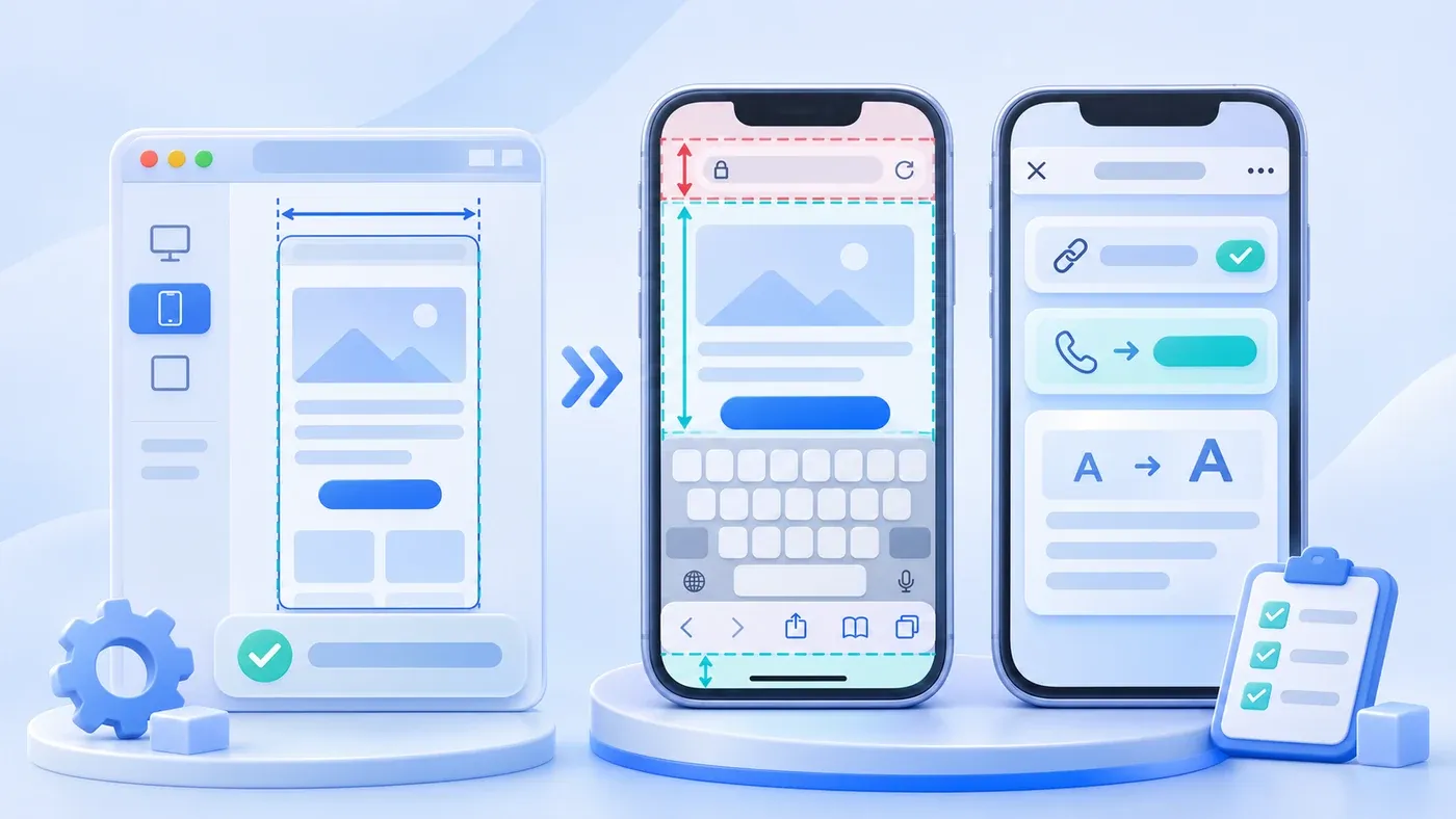
Right before a corporate website launches, a familiar line pops up in project chat: "I opened DevTools on my laptop, switched Chrome to 390px and 320px, saw zero horizontal scrollbars, and checked every section—we're good on mobile, right?"
The short answer is no: narrowing a desktop browser window or using DevTools mobile emulation verifies CSS breakpoints and horizontal overflow, never real-device mobile readiness. A desktop monitor is a quiet, flat rectangle with fixed height, workstation CPU speed, office Wi-Fi, a mouse cursor, and zero host-app wrappers. Real smartphones introduce collapsing browser toolbars, software keyboards, touch-only physics, in-app WebViews like WeChat and WhatsApp, cellular jitter, and OS-level font scaling. Since Google evaluates pages via mobile rendering under Google Search Central's Mobile-First Indexing Best Practices, device defects can hurt usability and, when they hide or block content, crawler access.
Consider a hypothetical scenario: An industrial equipment supplier updates its bilingual site right before a trade show. After passing a 390×844 laptop review, the team prints booth QR codes. On day one, visitors scan on real phones and hit three snags: Safari's bottom toolbar covers the floating inquiry button, tapping a phone field zooms the page sideways, and tapping a copy button inside an embedded messenger stalls silently. None of those surfaced during desktop resizing.
Device emulation can reveal many problems and can simulate touch and network limits. It is useful evidence during development, while acceptance still needs the target device. The common 16px input recommendation is not a WCAG minimum, and focus zoom varies with the browser, version, and viewport configuration.
Run repeated-submit, failure-response, and callback checks with synthetic data in an authorized isolated environment. Public consultation forms are for real inquiries, not load or rate-limit probing.
Five Real-Device Failure Categories Desktop Resizing Cannot Catch
- Use desktop emulation early
- Verify on target devices
- Check layout and simulated input
- Test keyboards, handoff and recovery
1. Dynamic Browser Toolbars, Shifting Viewport Height, and Safe Areas
On a laptop, window height stays fixed unless you drag the frame, so 100vh (100% viewport height) matches the visible area. On physical phones, viewport height shifts dynamically: on initial load, Safari and Chrome show expanded address and bottom toolbars, retracting them only after scrolling down.
Per web.dev's guide to large, small, and dynamic viewport units, classic 100vh locks to the large viewport (toolbars retracted). Consequently, hero sections or bottom-pinned CTAs sized to 100vh bleed beneath the expanded bottom bar on load. Mobile builds need svh (stable small viewport with toolbars visible) or dvh (dynamic viewport—noting that updates throttle during fast swipes rather than running at 60fps). Likewise, notches and home-indicator bars require viewport-fit=cover in <meta name="viewport"> (MDN viewport guide) plus env(safe-area-inset-bottom) (MDN env() reference); on a flat desktop display, env() evaluates to 0, completely hiding bottom clipping bugs.
2. Virtual Keyboard Occlusion and iOS Form Auto-Zoom
Desktop browsers never cover half the screen with a software keyboard. On real phones, tapping a field opens the virtual keyboard—and as web.dev notes, the keyboard does not shrink vh, svh, or dvh by default. Under MDN's interactive-widget spec, default resizes-visual shrinks only the visual viewport without reflowing fixed layout elements, letting pinned footers or floating bars cover active inputs and validation messages.
A second frequent trap is iOS auto-zoom: per web.dev's Learn Forms design basics, <input>, <textarea>, and <select> controls computed below 1rem (16px) trigger automatic page zoom when focused in iOS Safari. Trying to block zoom via user-scalable=no violates WCAG scaling rules and is ignored by iOS 10+ anyway (MDN). Only tapping each field on an actual iPhone verifies zero zoom jumps, correct numeric/email keypads, and accessible submit controls.
3. Touch Gestures, No-Hover States, and Scroll-Lock Physics
DevTools' gray touch pointer cannot mimic a human thumb's contact area or mobile scroll inertia. (While menu structure belongs to mobile navigation planning and 24px vs. 44px pixel math belongs to target-size audits, real-device QA checks touch physics.)
Per MDN's @media (hover) reference, desktop cursors report hover: hover, whereas touchscreens report hover: none or emulate hover awkwardly via long-press. Tooltips or submenus gated on hover fail on phones or get stuck in "sticky hover" states after navigating back. Physical thumb scrolling also triggers accidental card taps, horizontal carousel conflicts, and iOS rubber-band overscroll leaking behind open drawer menus.
4. In-App WebViews (WeChat / WeCom / WhatsApp) and System Clipboard Gaps
B2B buyers often tap shared links inside WeChat, WeCom, or WhatsApp rather than opening Safari or Chrome directly. Those in-app WebViews inject host header bars, intercept edge-swipe back navigation and long-press QR scanning, and apply stricter external-app launch rules.
Two handoffs require physical hardware verification:
- WeCom and WhatsApp app launch: Chinese mobile links should launch WeCom contact cards (or clean fallbacks), while English pages launch
wa.mechats directly without leaking domestic QR modals. Only a real phone confirms the handoff works and leaves the page intact if canceled. - OS clipboard round-trips: "Copy checklist" or "Copy email" buttons usually rely on
navigator.clipboard.writeText(). As MDN'sClipboard.writeText()guide explains, clipboard writes require HTTPS and active user gestures, throwingNotAllowedErrorwhen blocked in restricted WebViews or insecure LAN previews. Always tap copy on real phones and paste into Notes or chat to verify the output and fallback message.
5. Cellular Latency, Mobile CPU Jank, OS Font Scaling, and Content Parity
Office laptops mask latency behind multi-core CPUs and fast Wi-Fi. Chrome's "Slow 3G" throttling misses exhibition-hall cellular jitter and smartphone main-thread stalls during hydration. Under web.dev's INP metric, touchscreen taps track pointerdown, pointerup, and click through to the next painted frame; a script pause unnoticed on desktop can cross 200ms on a mid-range phone, prompting double-taps on submit buttons.
Physical phones also test OS text scaling: unlike desktop whole-page zoom (Ctrl +), raising system font size—relevant to W3C WCAG 2.2 SC 1.4.4 Resize Text—enlarges text inside fixed containers, clipping English labels. Finally, check Google's mobile-first indexing rules over cellular data: primary text and imagery must load promptly without requiring a swipe or tap first.
Desktop Viewport Emulation vs. Physical Phone Mandatory Check Comparison
Audit Dimension | What Desktop Resizing / F12 Checks | What Only a Physical Phone Verifies | Why Desktop Emulation Misses It |
|---|---|---|---|
Width & Cutouts | 320px/390px breakpoints, wrapping, zero horizontal overflow | Retina clarity, orientation switch, notch & home-bar clearance | Desktop windows are flat rectangles; |
Hero & Bottom CTAs | Relative alignment inside a fixed preview height | Whether expanded top/bottom toolbars cover | Desktop lacks collapsing toolbars; |
Forms & Keyboards | Validation error wording and input border styles | iOS | Desktop has no virtual keyboard overlay or iOS Safari zoom trigger |
Touch & No-Hover | Click state CSS and drawer open/close toggles | Hover-trapped UI, sticky tap highlights, thumb mis-taps, scroll-bleed | Mice emit |
WebViews & OS Bridge | Valid | WeChat/WeCom/WhatsApp WebViews, | Laptops lack mobile host WebViews and OS clipboard rules |
Network & Text Scale | Total asset weight and synthetic load order | Cellular jitter, scroll/tap INP lag, OS font scaling inside cards | Laptop CPUs mask jank, and zoom scales boxes alongside text |
Pre-Launch 12-Point Physical Phone Acceptance Checklist
You do not need twenty test phones. Borrow one iPhone (iOS Safari + WeChat) and one or two Android phones (Chrome + WeChat) from the team and split these 12 checks over 20 minutes against your staging URL (pair this pass with full CMS permission, redirect, and SEO launch verification):
[Pre-Launch 12-Point Physical Phone Acceptance Checklist]
Target URL: ________________________  Tester: ____________  Date: __________
Devices & OS (iOS Safari + WeChat / Android Chrome + WeChat): ______________

1. Viewport, Safe Areas & Dynamic Toolbars (iOS Safari / Android Chrome)
[01] Initial load clearance: Open Home, Services, and Consultation without scrolling; confirm hero CTAs and bottom triggers stay fully above browser toolbars and home bars.
[02] Toolbar retraction & progress bar: Swipe down a long Insights article into the footer; verify smooth transitions and a top progress line that fades out at the footer.
[03] Rotation & narrow-screen stability: Rotate landscape and back to portrait (plus check a compact phone); confirm zero horizontal overflow or misaligned drawers.

2. Virtual Keyboard, Forms & OS Font Scaling (iOS Safari / Android Chrome)
[04] No iOS form auto-zoom (priority: iOS Safari): Tap every input, textarea, and select on Consultation/Contact; confirm zero sudden page zoom or sideways drift.
[05] Keyboard-open errors & submit reachability: Leave a required box blank while keyboard stays open and tap Submit; confirm errors stay visible, Submit stays reachable, and notes persist.
[06] OS system font scaling: Bump phone system text size 1–2 steps and reload key bilingual pages; verify longer English buttons and card titles wrap without clipping.

3. Touch Physics & No-Hover Behavior (iOS Safari / Android Chrome / WeChat)
[07] Hover-free controls & sticky highlights: Open drawers, service accordions, and interior pages, then tap Back; confirm all desktop hover hints work on tap with no stuck highlights.
[08] Scroll lock & accidental tap safety: Swipe over open drawer backdrops and scroll lists one-handed; confirm zero background scroll-bleed and no accidental card clicks.

4. In-App WebViews, Messaging & Clipboard (WeChat / WhatsApp / System Browser)
[09] In-app WebView layout & gestures: Open staging links inside WeChat (and WhatsApp on overseas phones); verify header clearance, image loading, sharing, and edge-swipe back.
[10] Locale-isolated WeCom & WhatsApp launch: Tap instant contact on Chinese pages and WhatsApp on `/en/...` pages; confirm clean app launch and zero Chinese QR leaks on English pages.
[11] Copy buttons & OS clipboard round-trip: Tap checklist or contact copy buttons in WeChat and system browsers, then paste into Notes; confirm intact text and visible fallback if blocked.

5. Cellular Latency & Mobile Content Parity (4G/5G Data, Cache Cleared)
[12] Cold cellular speed, INP & double-tap guard: Clear cache over cellular data, open Home and Consultation, and double-tap Submit; confirm prompt content load without swipe-gating and only one lead saved.
Running these twelve hardware checks before launch prevents silent mobile breakages from reaching buyers on day one. If you are planning a bilingual website build or preparing for launch, explore our Corporate Website & Standalone Site Services, try our consultation page directly from your phone, or reach out via our Contact page with your staging URL and QA checklist.
Sources
- MDN Web Docs: <meta name="viewport"> HTML attribute value ↗
- web.dev (Google): The large, small, and dynamic viewport units ↗
- Google Search Central: Mobile-First Indexing Best Practices ↗
- web.dev (Google): Learn Forms — Design basics ↗
- MDN Web Docs: hover CSS media feature ↗
- MDN Web Docs: env() CSS function ↗
- MDN Web Docs: Clipboard.writeText() method ↗
- web.dev (Google): Interaction to Next Paint (INP) ↗
- W3C WCAG 2.2 Understanding SC 1.4.4: Resize Text ↗
