
Key takeaway
When sharing one component library, lock colors, typography, interactions, and heading semantics—while adapting module order, card fields, optional block visibility, and proof visuals to each page's task so service pages clarify scope and product pages speed selection.
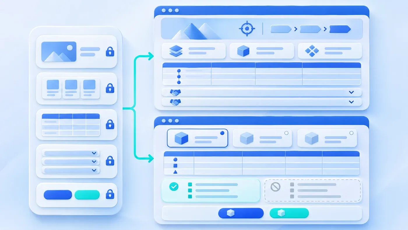
When companies standardize their website around a modern design system and reusable component library—shared blue-white tokens, hero sections, feature grids, tables, accordions, and consultation blocks—engineering velocity goes up and layout bugs go down. Yet many teams soon hit a frustrating wall: click from a service page to a product page or solution overview, and every page shares the exact same vertical rhythm, card count, and boilerplate phrasing.
Component reuse is meant to stabilize front-end engineering and visual consistency, not flatten distinct offerings into identical templates. The fix requires a clear architectural line: lock styling, interaction rules, and semantic markup inside the component library, while letting module order, field schemas, block visibility, and proof artifacts adapt to each page's decision task.
What Should Be Locked vs. Flexible in a Reusable Component System
Cookie-cutter pages usually stem from two extremes: either letting editors freely drag-and-drop every pixel until spacing collapses, or hard-coding one rigid template sequence where every service and product squeezes into identical slots. A maintainable setup divides responsibilities into two layers:
- Locked system standards (strictly uniform across the site): Brand colors, contrast ratios, typographic hierarchy, grid breakpoints, accordion motion, keyboard focus rings, and semantic HTML structure. As outlined in the W3C WAI Page Structure Tutorial, well-defined page regions, labeled landmarks, and logically nested headings (
H1throughH3) allow visitors, screen readers, and search engines to navigate sections reliably. Keeping these rules locked ensures reordering blocks never breaks accessibility or responsive layout. - Page-task configuration levers (tailored per page role): Module sequence (moving whichever section answers the buyer's urgent check right below the hero), card field schema and column count (three-column scenario cards vs. two-column limit comparisons), optional module visibility (hiding irrelevant process strips instead of padding them with filler), and visual evidence format (hardware dimension drawings vs. phased deliverable tables).
This distinction directly supports search quality and reader usefulness. In its guide to Creating Helpful, Reliable, People-First Content, Google specifically warns against mass-producing templated pages where individual URLs fail to receive dedicated attention and value. Even after establishing an accurate internal repository as described in Turning Product Documentation into Marketing Content, pouring facts into an unvarying page skeleton still obscures what makes each offering distinct.
One System, Two Rhythms: Service Page vs. Product Page Assembly
- Consistent visual and interaction rules
- Order sections for the task
- Stable component boundaries
- Choose content for the business
The hypothetical comparison below shows how the exact same five reusable front-end components—Hero, Card Grid, Data Table, Accordion, and Bottom CTA—create two distinct reading experiences simply by changing sequence, card variants, and proof formats:
- Hypothetical Example A (Non-Standard Service Page): Custom Business System Development. Visitors want to verify whether you understand messy workflows, where scope boundaries sit, what tangible deliverables appear at each stage, and whether they can talk before writing a full RFP.
- Hypothetical Example B (Standard B2B Product Page): Industrial Corrosion-Resistant Flowmeter. Visiting engineers and buyers want to verify fluid compatibility, rule out misapplications, compare sibling pipe sizes, grab CAD drawings, and quote an exact SKU.
Shared Component | Service Page Assembly (Hypothetical Example A) | Standard Product Page Assembly (Hypothetical Example B) | How Focus Diverges |
|---|---|---|---|
1. Hero Section | Slot 1: Pain-to-outcome subhead + 3 capability pills + "Discuss Your Workflow" CTA; paired with a "Spreadsheet-to-Role-Permissions Diagram." | Slot 1: Model code & stock badge + measurement/media spec bar + "Request Model Quote" CTA; paired with a "Dimensioned Hardware Wireframe." | The service hero builds workflow empathy; the product hero surfaces hard specs and supply status in seconds. |
2. Info Card Grid | Slot 2 (3-column grid): Three client starting points (new build, legacy replacement, add-on module) with "Trigger + Focus" fields. | Slot 3 (2-column contrast grid): Left column lists "Recommended Media & Conditions"; right column lists "Explicit Limits & Alternative SKUs." | Services need rapid self-identification first; products screen numbers first and then highlight operating limits. |
3. Structured Data Table | Slot 3 (4-phase deliverable table): Columns for Phase, Client Input, Artifact, and Sign-off Gate. | Slot 2 (searchable selection matrix): Compares pipe diameters, lining materials, and signal outputs across sibling models with the active SKU highlighted. | Promoting the table to Slot 2 turns the product page into an instant selector; the service table anchors mid-page expectations. |
4. Accordion Block | Slot 4 (6-question scoping FAQ): Covers legacy spreadsheet import, phased releases, and starting without a full spec. | Slot 4 (prerequisites & downloads): Disables consulting FAQs and expands wiring protocols, straight-pipe rules, and 2D/3D CAD files. | One accordion shell serves either pre-sales clarity or technical download bundles via field configuration. |
5. Related Strip & CTA | Slot 5: Low-friction prompt ("Bring one sample spreadsheet for a 20-minute review") supporting the path in How B2B Website Content Creates Leads. | Slot 5: Attaches the current flowmeter SKU to the inquiry button, asking only for fluid and pipe size, with WhatsApp/WeCom options by region. | Context-aware CTAs preserve buyer intent instead of dropping visitors into a blank contact box. |
Notice that standard hardware pages also turn off the consulting process strip completely—keeping codebase maintenance limited to one component library via slot ordering, visibility toggles, and column variants.
Content Differentiation Matrix for Common Reusable Components
Before auditing templates across your site, align design, engineering, and editorial leads on the locked rules and flexible levers for each recurring block:
Reusable Component | Locked Design-System Standards | Page-Level Content Levers | Cookie-Cutter Anti-Pattern to Avoid |
|---|---|---|---|
Hero Section | Type scale, button geometry, safe margins, contrast tokens | Proof graphic (device wireframe vs. system diagram), status pills, secondary link target | Reusing the same slogan formula and abstract 3D sphere graphic on every page |
Info Card Grid | Card radius, borders, hover states, mobile single-column stack | Column count (2-col contrast vs. 3-col pillars), fields per card, step numbers | Forcing four symmetrical cards when an offering only has two real points |
Data / Comparison Table | Header styling, dividers, mobile horizontal scroll behavior | Column schema (SKU specs vs. project deliverables vs. role matrix), slot position | Pasting flat JPG screenshots of printed tables or identical three-column headers |
Accordion Block | Expand/collapse motion, keyboard | Content payload (scoping Q&A vs. site prerequisites + CAD links), default open state | Appending ten identical company-wide filler questions at the bottom of every URL |
Proof & Related Strip | Grid spacing, aspect ratio, arrow link styling | Proof granularity (scoped project cards vs. certification IDs vs. scenario notes) | Showing the exact same three unrelated articles or generic trust badges sitewide |
Bottom Inquiry CTA | Button contrast, form validation, explicit privacy consent pattern | Prompt copy, pre-selected service or model context, regional chat routing (WhatsApp internationally, WeCom in China) | Sending both a precision hardware buyer and a custom software lead to an identical blank form |
Anti-Homogenization Review Checklist for Component-Based Pages
Whenever launching new business pages or updating your Brand Presence Solution pages on a shared component system, run this 10-minute cross-team check:
[Anti-Homogenization Review Checklist — Reusable Component Pages]

1. Side-by-Side Differentiation
- [ ] Open a service page and a product page side by side: their top three sections follow genuinely different sequences, not mirror layouts.
- [ ] Hero visuals show distinct artifacts (e.g., hardware dimensions vs. workflow architecture) rather than interchangeable stock graphics.

2. Module Omission & Density
- [ ] Unneeded blocks are hidden via template toggles instead of being padded with generic corporate copy.
- [ ] Card grids adapt column counts and copy depth to real information rather than forcing symmetrical four-card blocks.

3. Decision-First Ordering & Crawlable Proof
- [ ] Each page surfaces its core evaluation proof (model selection/limits for products, scope/deliverables for services) in the upper half.
- [ ] Tables and specs use real, searchable HTML text rather than flattened images.

4. Semantic Hierarchy & Accessibility
- [ ] Reordering sections still leaves one unique H1 and unbroken H2-to-H3 nesting per page.
- [ ] Toggling variants or hiding blocks preserves spacing, contrast, and keyboard tab order across desktop and mobile.

5. Contextual CTA Continuity
- [ ] Bottom inquiry prompts, regional messaging channels, and pre-filled fields carry the exact service or SKU context from the page.
A shared component library pays off when teams stop rebuilding buttons and grids on every page—freeing time to sharpen reading order, scope boundaries, and verifiable proof for each audience. If you are planning a multi-line corporate site or want reusable templates that still give every offering a distinct voice, explore our Corporate Website & Standalone Site Services or bring two draft pages that feel too similar to our consultation page for a structural review.
