
Key takeaway
Mobile corporate navigation should neither cram desktop mega-menus into a drawer nor delete key business links. Without mouse hover, keep the sticky bar to logo and menu toggle, place 5–7 core sections with overview links, language switch, and primary CTA in the drawer, and move secondary links to the footer.
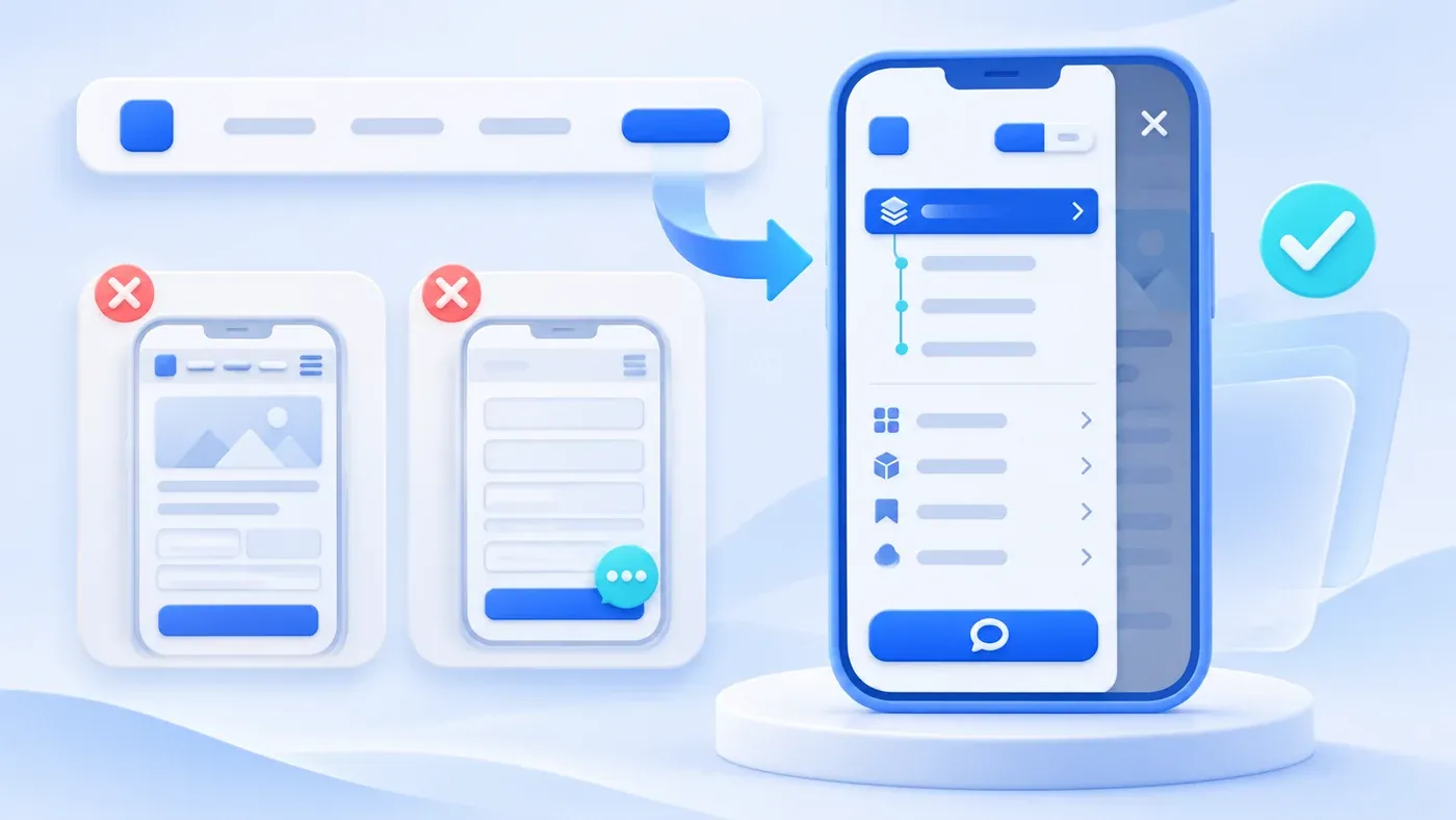
In most website reviews, teams evaluate layouts on a conference room display or a widescreen laptop. Across a 1440-pixel monitor, the top header has plenty of room, and hovering a mouse over "Services" or "Solutions" reveals a three-column mega-menu with icons and blurbs. In actual B2B buying, however, prospective clients often open your site for the first time on a phone—tapping a link in a chat group, scanning a QR code at a trade show booth, or searching between meetings.
On a narrow mobile screen, desktop navigation patterns frequently break down. Ten header tabs get crammed behind a hamburger icon that opens into a three-screen scroll; tapping "Services" toggles an accordion shut instead of opening the Services overview page; international buyers cannot find the language switcher; and a floating chat widget sits right on top of the form's "Submit" button.
Prioritizing mobile navigation is not about shrinking your desktop header until it fits. It is about redesigning wayfinding for a narrow vertical screen with single-thumb operation and zero mouse hover. Getting mobile navigation right comes down to three decisions: splitting entry points across the sticky top bar, the drawer menu's first screen, and the global footer; giving parent-child menus explicit "Overview" links; and keeping floating contact widgets clear of page actions.
Why "Keeping Mobile Clean" Never Means Deleting Core Business Links
Faced with a crowded mobile menu, some teams overcorrect by stripping out secondary links altogether—giving desktop visitors a full catalog of services, solutions, and insights while leaving mobile visitors with only "Home," "About," and "Contact."
Removing core business links from mobile hurts both buyers and search visibility. According to Google Search Central's Mobile-First Indexing Best Practices, Google indexes and ranks pages based on the mobile version of a site, so your mobile site should contain equivalent primary content and structural links to your desktop site. While Google notes that you can adapt mobile layouts for usability—such as moving content into accordions or tabs to save space—you should avoid removing important content from mobile pages.
In practice, simplifying mobile navigation means collapsing visual hierarchy and stripping out decorative filler, not deleting business pages. Every core service, solution, project case, and language version reachable on desktop should remain reachable within two or three taps on a phone.
Three-Layer Space Allocation on Mobile: Sticky Bar, Drawer First Screen, and Footer
- Persistent bar: brand and menu
- Drawer: primary destinations
- Inquiry: a clear primary action
- Footer: supporting information
Vertical screen height is scarce on a phone. If a two-row sticky header takes the top fifth of the viewport and a thick banner locks the bottom fifth, visitors read through a narrow slot. A clean mobile architecture divides navigation across three layers:
1. The Sticky Top Bar: Strictly 2–3 Elements
While a visitor scrolls through an article or service page, the sticky top bar only needs to confirm brand identity and provide menu access:
- Left side: Your brand logo. Drop long taglines beside the mark on narrow screens so the logo stays legible without crowding the right side.
- Right side: A clear menu toggle button, paired at most with one compact utility item (such as a
ZH / ENtoggle or a compact consultation link). - Drop desktop menu decorations: Promotional thumbnails, decorative icons, and section summaries that work inside a desktop mega-menu should be hidden on mobile so they do not bloat vertical height.
2. The Drawer Menu's First Screen: Full Site Skeleton Without Scrolling
When a buyer taps the menu icon, the slide-out drawer acts as your site's switchboard. Visitors should see three core groups on the first screen of the drawer without scrolling:
- Top utility bar (Language Switcher): On a bilingual site, place the
ZH / ENswitcher prominently at the top of the drawer, marking the active language with font weight and an underline. If an overseas buyer scans a QR code that opens a Chinese page, they can switch to the corresponding English page immediately upon opening the menu. - Middle 5–6 top-level sections: Keep the exact same core sections and relative order as your desktop header (Services, Solutions, Projects, Process, Insights, About). Keep second-level lists collapsed by default—or expand only the active section—so the drawer does not open as a wall of twenty links.
- Bottom primary action button: Anchor a full-width, high-contrast "Consultation" button at the bottom of the drawer within easy single-thumb reach. As we discuss in How Corporate Website Content Generates B2B Leads, once a visitor verifies fit and credibility, starting a conversation should require zero hunting.
3. The Global Footer and Floating Contact Bar: End-of-Page Catchers That Stay Out of the Way
When a mobile visitor reaches the bottom of a page, your global footer should work as a secondary sitemap and direct contact hub:
- Provide direct links to core services, solutions, and preparation tools (such as our Website Project Preparation Checklist).
- Match contact actions to the device: desktop visitors scan QR codes with a phone, but mobile visitors are already on their phone. Mobile links should launch an official WhatsApp chat (with pre-filled context) for international visitors or an official WeCom contact link for domestic China visitors, keeping QR codes as a fallback.
If you use a floating contact bar or reading progress line, enforce non-interference rules: keep mobile reading progress to a thin top line that fades out in the footer, leave clearance around form submit buttons, and close contact popovers when tapping outside.
Solving the "No Hover" Problem: How Should Submenus Expand on Touchscreens?
The biggest mechanical difference between desktop and mobile menus is that touchscreens have no mouse hover state. On desktop, hovering over "Services" opens the dropdown, while clicking "Services" navigates to /en/services (the Services Overview page). On a phone, every action is a tap, and porting desktop dropdown scripts directly to mobile causes one of two bugs:
- The Dead-Parent Trap: Tapping "Services" only toggles the accordion, making the Services Overview page unreachable on mobile.
- The Premature-Jump Trap: Tapping "Services" immediately loads the overview page before the accordion can open, blocking visitors from picking a sub-service.
The cleanest solution is to let the parent label toggle the accordion and place an explicit "Overview" link on the first row of the expanded list:
- Tapping "Services" expands the child list.
- Row 1 reads "Services Overview" (or "Solutions Overview" / "All Insights"), followed by specific offerings like Corporate Website & Standalone Site, Business System Development, AI Applications & Workflows, and Content & Interactive Support.
Consider a hypothetical scenario: An industrial equipment integrator printed its website QR code on trade show banners. Previously, its mobile drawer copied a three-level desktop menu where parent labels only toggled accordions and the English link sat in the footer. International visitors scanning the QR code could not switch languages quickly or open the Solutions hub. By moving ZH / EN to the top of the drawer, keeping six top-level sections, adding explicit "Overview" links inside each accordion, and replacing an intrusive chat bubble with a direct WhatsApp link and bottom consultation button, the team turned a mobile maze into a two-tap path.
Desktop-to-Mobile Navigation Transformation Reference Table
Use this table when auditing how your desktop header translates to mobile:
Desktop Element | Desktop Format | Mobile Strategy | Mobile Placement | Why It Matters |
|---|---|---|---|---|
Brand Logo | Logo + name + slogan | Keep mark; trim slogan | Left of sticky bar | Prevents crowding the toggle or wrapping lines |
Top Sections (5–7) | Horizontal header row | Drawer first screen | Primary drawer list | Keeps consistent order without horizontal scroll |
Overview Link | Clicking parent tab | Explicit first child link | Row 1 of accordion | Solves the "no hover" conflict on touchscreens |
Subpages | Multi-column menu | Single-column accordion | Under parent + footer | Keeps core business URLs crawlable in two taps |
Promo Cards | Thumbnails & blurbs | Hide in mobile menu | Desktop only | Saves vertical height so links fit on screen |
Language (ZH / EN) | Right of desktop bar | Keep at top of drawer | Top of drawer | Lets international visitors switch locales at once |
Consultation CTA | Top-right button | Full-width button | Bottom of drawer | Places conversion action in the thumb reach zone |
WhatsApp / WeCom | QR code popover | Direct launch link | Footer & contact bar | Tapping a link on a phone beats scanning a screen |
Mobile Navigation and Contact Entry Checklist
Before launching a website or redesign, test the site on a real phone (in WeChat and Safari/Chrome) against this checklist:
[Mobile Navigation & Contact Entry Checklist]
Tested URL / Device Environment: ____________________  Date: ________________

1. Sticky Top Bar Height & Clarity
   [ ] Scrolling down keeps the sticky header on a single compact line
   [ ] Brand logo and menu toggle have clean spacing with no overlap

2. Drawer Menu First-Screen Efficiency
   [ ] Opening the menu shows all 5–7 core sections without long vertical scrolling
   [ ] Decorative mega-menu thumbnails, icons, and blurbs are hidden on mobile
   [ ] Background page scrolling is locked while the drawer is open

3. Parent Overview & Submenu Reachability (No-Hover Test)
   [ ] Sections with subpages include both child items and an explicit "Overview / All" link
   [ ] All published core business pages on desktop remain linked in the mobile menu or footer

4. Bilingual Switching (For Multilingual Sites)
   [ ] The ZH / EN switcher is visible at the top of the drawer with the active locale marked
   [ ] Tapping the alternate language switches the current page rather than resetting to Home

5. Consultation & Instant Contact Ergonomics (Non-Blocking Test)
   [ ] A high-contrast "Consultation / Contact" button sits at the bottom of the drawer
   [ ] Mobile WhatsApp or WeCom links launch chats directly, keeping QR codes as fallback
   [ ] Floating contact bars never block form "Submit" buttons and close when tapping outside
Mobile navigation is often the first interface a buyer touches after scanning a brochure or tapping a shared link. If you are planning a bilingual website redesign or need to clean up a mobile menu that hides key pages, explore our Corporate Website & Standalone Site Services or share your current site URL through our consultation page to map out a clearer desktop and mobile experience.
