
Key takeaway
Website navigation gets cluttered when menus mirror internal departments, temporary campaigns, or coined jargon instead of buyer tasks. Keep top-level menus to 5–7 core destinations, group dropdowns by buyer questions, move utility links to the footer, and enforce clear rules before adding new tabs.
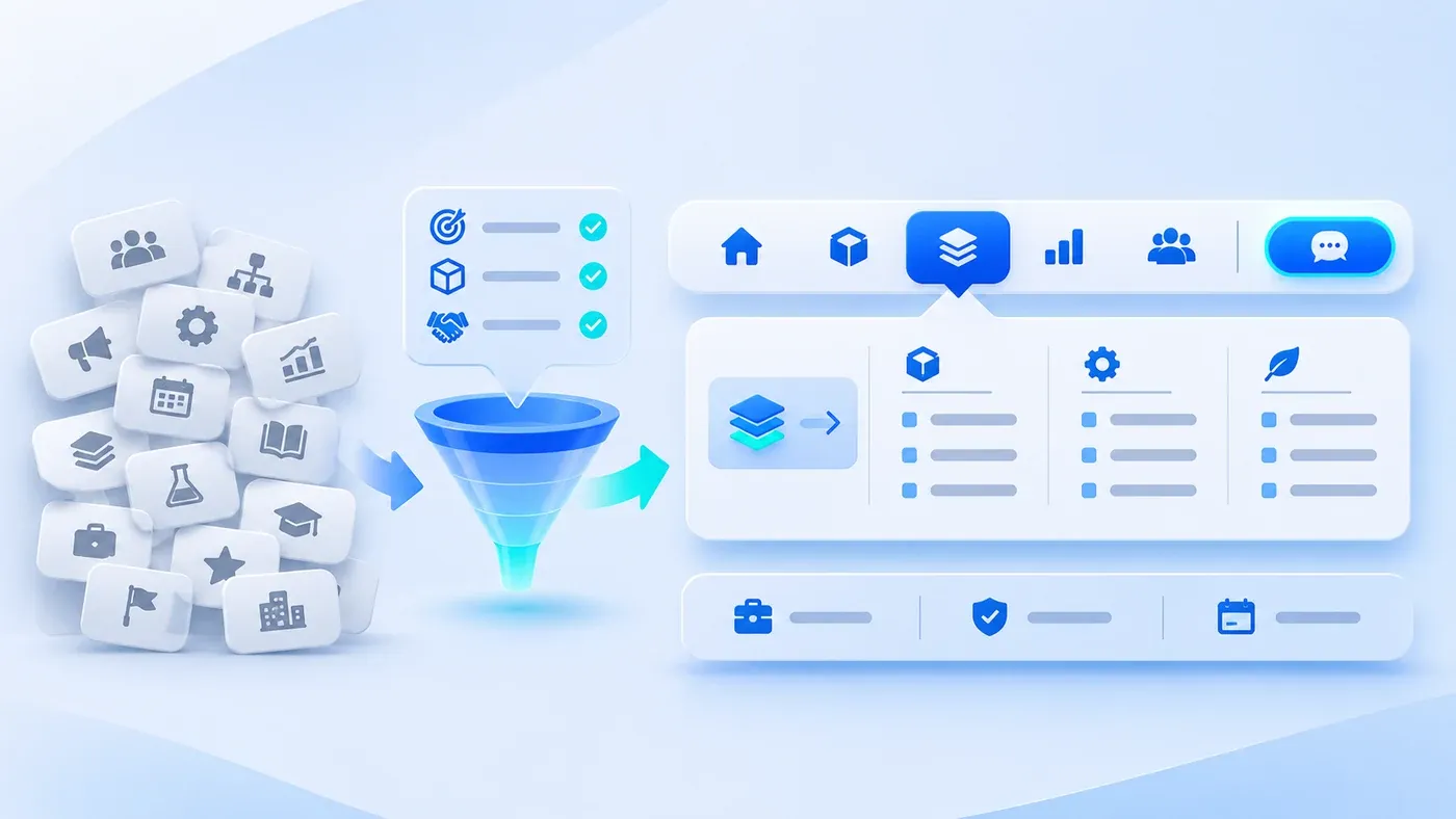
When a corporate website first launches, its top navigation bar is almost always clean: Home, Products, Case Studies, About, and Contact. Check the same site two years later, and the header has often snowballed into nine or ten competing tabs. A new business division demanded its own link, marketing pinned an annual summit microsite, channel sales added partner recruitment, and a branding refresh introduced coined slogans. Prospective buyers hover over labels like "Smart Matrix," "Ecosystem Empowerment," or "Division II" and still cannot tell where to verify standard specifications or request a quote.
Website navigation rarely gets cluttered because a business grew too complex. It gets cluttered because teams mistake their internal organizational chart and campaign calendar for a buyer's wayfinding system. Keeping your menus clear as your company evolves requires three structural rules: deriving top-level sections from buyer lookup tasks rather than internal reporting lines, dividing responsibilities across top-level tabs, second-level dropdowns, and the global footer, and enforcing an admission checklist whenever someone asks to add a new tab.
A starting range of five to seven top-level entries is an editorial planning aid, not an accessibility or search-engine requirement. Validate the actual number against reader tasks, content size, label length, and mobile use.
Why Website Navigation Degrades Over Time: Confusing Internal Org Charts with Buyer Journeys
When we audit corporate websites where visitors struggle to find basic offering details, navigation clutter almost always traces back to three habits:
- Splitting top-level tabs by internal business units: Menus listing "Division One," "Division Two," and "Innovation Institute" make sense to employees, but mean nothing to an external procurement lead. Buyers arrive looking for a specific component, software capability, or service scope—not your internal reporting hierarchy.
- Replacing plain business nouns with coined branding jargon: Calling your product catalog "Intelligent Matrix" or renaming solutions "Value Co-Creation" forces first-time visitors to guess what sits behind each click. Every ambiguous label adds friction before the visitor even sees your content.
- Giving temporary campaigns and secondary audiences equal weight in the header: Trade show pages, job openings, and company awards often get appended straight to the main bar. When ten items share the same visual weight, your core revenue-driving pages lose focus.
As we outlined in How Corporate Website Content Generates B2B Leads, a buyer's first two steps on your site are discovery and matching—confirming quickly that your company solves their problem and has the evidence to prove it. Your navigation bar is the primary road sign for that matching process. If the road signs are written in internal shorthand, qualified visitors leave before reaching the pages meant to convert them.
Deriving Top-Level Menus, Dropdowns, and Footer Roles from Visitor Tasks
- Main navigation: core tasks
- Submenus: service pathways
- Page sections: detail and context
- Footer: supporting information
The most reliable way to plan a sitemap is to put away your department chart and ask one question: When a prospective buyer lands on our site, what sequence of verification tasks do they need to complete before deciding to contact us?
Mapping those tasks divides your site's navigation into three distinct layers:
1. Top-Level Header Navigation (5–7 Items Max): High-Frequency Buyer Tasks Only
The top header bar is the most valuable real estate on every page. For most B2B product and professional service companies, top-level navigation fits cleanly into five or six standard destinations plus one visually distinct action button on the far right:
- What You Deliver (Products / Services): Lets visitors inspect core offerings, deliverables, specifications, and service boundaries by category.
- Which Scenarios You Solve (Solutions / Industries): Gives visitors searching by business problem or industry context a direct entry point.
- Proof That It Works (Projects / Case Studies): Shows real implementation scope, constraints, and verifiable outcomes.
- How You Think (Insights / Guides): Houses practical methodology articles, checklists, and documentation that help evaluators frame their project.
- Who You Are (About Us): Groups company background, how your team works, company news, and office details.
- How to Start a Conversation (Consultation / Contact Us): Styled as a standalone primary button on the right side of the header for immediate access.
If your company focuses on a single core offering, four or five top-level items are plenty. Never split thin content across multiple top-level tabs just to make the header look fuller.
2. Second-Level Dropdown Menus: Three-Second Scannable Grouping
When a top-level section contains multiple subpages, the dropdown menu's job is to help visitors narrow their target within three seconds—not to dump forty links onto the screen:
- Include an explicit "Overview" entry: When a section like Services or Solutions has both a hub page and detail pages, include a clear "Services Overview" link alongside the specific items.
- Stick to one classification logic per menu: Group a dropdown either by capability/product line or by industry scenario, rather than mixing department names and campaign tags. As the Google Search Central SEO Starter Guide notes on organizing your site, structuring pages logically and grouping topically similar pages into directories helps both users and search engines understand how individual pages relate to the rest of the site.
- Keep navigation order consistent across every page: Avoid reordering header tabs as users move between pages. The W3C WAI guidance on WCAG 2.2 Success Criterion 3.2.3 (Consistent Navigation) emphasizes that repeated navigation mechanisms should appear in the same relative order each time so visitors can locate information predictably.
3. The Global Footer: Low-Frequency Lookups, Specific Audiences, and Prep Tools
Moving a link out of the top header does not mean hiding it. Because the global footer appears at the bottom of every page, visitors naturally scroll there for institutional, legal, or secondary resources:
- Audience-specific entries: Careers, partner inquiries, privacy policies, terms of service, and licensing records.
- Deep indexing and preparation tools: Direct links to service lines, company news archives, practical checklists (such as our Website Project Preparation Checklist), and regional contact channels.
Consider a hypothetical scenario: An environmental testing equipment manufacturer originally had ten top-level tabs: Home | Gas Division | Water Division | Smart Cloud | Zero-Carbon Ecosystem | News Center | Honors | Downloads | Careers | Contact. A plant engineer looking for a flue-gas analyzer could not tell whether to click "Gas Division" or "Zero-Carbon Ecosystem." Reorganized around buyer tasks, the header shrank to six items: Products & Instruments | Industry Solutions | Project Cases | Guides & Insights | About Us | Request Consultation. Internal divisions became product categories under Products & Instruments, "Zero-Carbon Ecosystem" became a scenario page under Industry Solutions, "Honors" moved inside About Us, and Careers moved to the footer.
Corporate Navigation Naming, Consolidation, and Placement Reference Table
Use the reference table below to spot insider jargon and misplaced links when auditing an existing or proposed sitemap:
Common Original Tab | Why It Confuses Buyers | Clearer Task-Based Name | Placement | Consolidation Notes |
|---|---|---|---|---|
Empowerment Hub / Smart Matrix | Coined terms hide whether you sell hardware, software, or services | Products / Services | Top Header | Use plain nouns buyers search for; save slogans for headlines |
Division I / Innovation Unit | Reflects internal reporting lines unknown to buyers | Product or Service Category | Dropdown Menu | Keep org charts internal; group by what buyers purchase |
Honors & Awards / Culture | Creates thin standalone pages with only a few certificates | Merged inside "About Us" | About page sections | Consolidate trust credentials on the company overview |
News Center / VIP Visits | Mixes internal ceremony recaps with industry analysis | Split "Insights" & "News" | Insights in Header; News in About | Keep educational articles in the main header |
Spring Expo / Launch Event | Makes the site look neglected once the event passes | Specific Event Title | Homepage banner; archive later | Never alter top navigation for short-term campaigns |
Careers / Investor / Legal | Serves non-buyer audiences who check the footer | Careers / Privacy & Terms | Global Footer | Keeps the main header focused on customer tasks |
Leave a Message / Get Quote | Overlapping links leave visitors unsure which gets a fast reply | Consultation / Contact Us | Header Button + Footer | Route to one page with forms, WhatsApp, or WeCom |
Five Admission Rules Before Adding Any New Navigation Item
To prevent navigation clutter from creeping back after launch, run every request for a new header tab through this five-step checklist:
[Website Navigation Admission Checklist]
Proposed Menu Label: ____________________  Requesting Team / Date: ________________

1. Buyer Task Test: Would a first-time buyer unfamiliar with our org chart actively look for this topic before contacting us?
   [ ] Yes -> Go to Check 2    [ ] No (internal news) -> Place in homepage callout or inner page
2. Label Clarity Test: Shown only the 1–3 words on the tab, can an external buyer predict what is on the page?
   [ ] Yes -> Keep label       [ ] No (jargon/code) -> Rename using plain industry nouns
3. Depth & Lifespan Test: Does it hold 3+ permanent pages (or an active collection) relevant for 12+ months?
   [ ] Yes -> Menu section     [ ] No (single page/event) -> Merge into existing page
4. Mutual Exclusivity Test: Is it distinct from existing top sections (Services/Products, Solutions, Projects, Insights, About, Consultation)?
   [ ] Distinct & <=7 tabs -> Evaluate top tab  [ ] Specific sub-item -> Place in dropdown
5. Bilingual Parity Test: Does the desktop header stay on one line, and is the localized English page and label ready?
   [ ] Ready -> Release        [ ] Incomplete -> Keep unpublished in that language
Your website navigation is not an internal trophy shelf or a billboard divided among departments—it is a tool that helps buyers verify your capabilities in as few clicks as possible. If you are planning a new website or untangling an overgrown menu structure, explore our Corporate Website & Standalone Site Services or bring your current sitemap to our consultation page to map out a cleaner architecture together.
