
Key takeaway
A corporate homepage hero section should not try to show every department. Instead, it must immediately clarify what you deliver, who it serves, why you are credible, and where to click next—replacing vague slogan carousels with a specific headline, scoped subheadline, authentic visual, and dual CTAs.
Two classic deadlocks happen during corporate website homepage reviews. First, an executive feels the hero headline sounds "too plain" and asks to replace a clear product description with an abstract slogan like "Empowering the Future of Intelligent Ecosystems." Second, four different internal departments demand top-level visibility, so the team compromises by building a five-slide auto-rotating carousel. When the site goes live, every internal stakeholder feels represented—except the first-time B2B buyer, who stares at the screen for several seconds and still cannot tell whether the company sells industrial hardware, custom software, or consulting services.
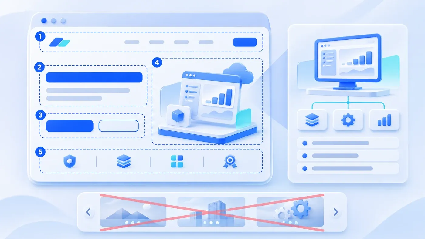
The first screen of your corporate homepage—everything a visitor sees above the fold before scrolling—does not need to tell your company's entire history or give equal real estate to every department. It has one critical job: helping a first-time visitor confirm within their first 10 seconds what you deliver, whose problem you solve, why your capability is credible, and where to click next. Doing that well requires organizing five elements in strict priority order: a specific headline, a boundary-setting subheadline, a paired primary and secondary call-to-action (CTA), one authentic visual that represents your work, and a compact, verifiable trust signal.
The “10-second” check below is an internal review exercise, not a measured attention-span limit or evidence of a conversion improvement. Set a suitable task and test it with your intended readers.
Why Grand Slogans and Five-Slide Carousels Fail B2B Visitors
Many companies treat their homepage hero section like a trade-show backdrop or an annual meeting slide, replacing concrete business facts with aspirational statements. In practice, that approach creates three recurring problems:
1. Turning an Internal Vision Statement into the Public Headline
Phrases like "Redefining Digital Possibilities" or "Building Tomorrow's Connected World" belong on an internal culture wall, not at the top of a B2B website. When a procurement lead, operations director, or R&D engineer opens your site, they are trying to complete a specific task—such as sourcing an optical inspection module, evaluating a workflow system, or finding a partner to rebuild a bilingual website. If your headline omits what you actually deliver, visitors have to guess.
As the W3C Web Accessibility Initiative (WAI) guidance on writing for the web points out, page titles and primary headings should front-load the most unique and relevant information and keep wording concise. Naming your core offering plainly outperforms poetic slogans every time.
2. Using Auto-Rotating Carousels to Avoid Internal Prioritization
When internal teams cannot agree on what belongs on the homepage, a multi-slide carousel feels like an easy truce: Slide 1 gets the brand slogan, Slide 2 features the flagship product, Slide 3 announces a trade show, Slide 4 highlights a secondary service, and Slide 5 promotes recruiting.
For actual visitors, carousels dilute your core message. The W3C WAI Carousels Tutorial explicitly notes that carousels are disputed from a usability perspective because content hidden behind secondary slides is hard to discover, and automatic movement often interrupts users before they finish reading complex text. Worse, when teams flatten headlines directly into banner image files, the text becomes illegible on mobile screens and violates the Google Search Central SEO Starter Guide recommendation to keep important page content in crawlable HTML text rather than embedding it inside images.
3. Crowding the Viewport with Equal-Weight Buttons and Pop-Ups
The opposite mistake is cramming six product links, an auto-opening chat widget, a floating QR code box, and a news ticker into the first screen all at once. When every element shouts at the same visual volume, visitors lose any clear starting path.
The Five Essential Hero Elements vs. Common Pitfalls
- Abstract slogans
- Specific offer and audience
- Carousels dominate attention
- Evidence and a next step
To make your first screen immediately understandable, structure your above-the-fold layout around five distinct elements in order of visitor attention:
Priority & Element | Role on the First Screen | Common Pitfall | Actionable Fix |
|---|---|---|---|
1. Headline | State your core product or service and the specific problem it solves in one sentence | Vague philosophical slogans, buzzwords, or displaying only the company name | Use a direct structure: "[Core Product/Service] for [Target Scenario/Audience]" or "[Specific Capability] Built for [Operational Outcome]" |
2. Subheadline | Clarify target buyers, scope boundaries, delivery format, or supported scenarios | Repeating generic adjectives ("professional, reliable, innovative, customer-first") | Name the 2–3 core deliverables, applicable industries, or collaboration models so visitors can self-qualify in seconds |
3. Dual CTAs (Primary & Secondary) | Give both ready-to-talk buyers and evidence-seeking researchers a clear next step | Using a single vague "Learn More" button, or lining up five identical buttons | Pair a high-contrast Primary CTA ("Request a Consultation") with a lower-friction Secondary CTA ("View Project Case Studies") |
4. Hero Visual | Visually confirm what the product, system, or deliverable actually looks like | Stock photos of handshakes, city skylines, glowing globes, or abstract waves | Show real hardware in context, a clean structural diagram of your software workflow, or a composite card of actual deliverables |
5. Compact Trust Signal | Provide one low-friction, verifiable proof point right below the copy or buttons | Unverifiable superlatives ("Industry Leader") or unauthorized client logos | Add a concise line of verifiable facts: supported technical standards, clear delivery scope, or bilingual market coverage |
Among these five elements, pairing a Primary CTA with a Secondary CTA solves one of the biggest conversion friction points on B2B sites. As we explored in How Corporate Website Content Generates B2B Leads, first-time B2B visitors arrive at different stages of readiness. Some already have an active project and want to talk to your team immediately; many others need to verify your project scope, technical boundaries, or past work before filling out a form.
Providing both a direct consultation button and a secondary evidence pathway serves both groups without forcing premature commitment. Just make sure the button labels describe the destination clearly—following W3C WAI's meaningful link text guidance, use concrete phrasing like "Book a Project Consultation" or "Explore Solution Scope" rather than generic labels like "Click Here" or "Read More."
Hero Copy and Visual Structures for Three Typical B2B Models (Hypothetical Examples)
How you write and illustrate your first screen depends on what you sell. Below are three hypothetical examples (constructed for structural demonstration, not actual client records) showing how different B2B business models apply the five elements:
Hero Component | Hypothetical Example A: Technical & Project Services (Custom Web & Business System Team) | Hypothetical Example B: Standard Industrial Products (Machine Vision Module Manufacturer) | Hypothetical Example C: Multi-Line Portfolio Business (Lab Water Systems, Consumables & Validation) |
|---|---|---|---|
Headline | Corporate Websites, Business Systems, and Practical AI Workflows Built Around Real Operations | High-Speed 2D/3D Machine Vision Inspection Modules for Automated Production Lines | Laboratory Pure Water Systems, Replacement Cartridges, and Compliance Validation Support |
Subheadline | From content structuring and UI design to Payload/Next.js development and bilingual deployment, we help teams launch maintainable digital systems. | Industrial line-scan cameras, lighting controllers, and standard PLC interfaces engineered for electronics assembly, battery cell inspection, and precision molding. | End-to-end equipment sizing, scheduled filter replacement, and pharmacopoeia qualification documentation for biotech and analytical testing labs. |
Primary CTA | Start a Project Consultation (routes to consultation form & official WhatsApp/WeCom options) | Request Spec Sheets & Sample Testing (routes to engineering inquiry form) | Request a Lab Water System Proposal (routes to solution inquiry page) |
Secondary CTA | Review Selected Projects (routes to project portfolio) | Browse Modules by Application (jumps to product specification matrix) | Direct Pathway Cards: Water Systems / Consumables / Validation Services (3 static cards below hero copy) |
Hero Visual | Composite diagram showing a bilingual corporate page, a structured inquiry workflow card, and role-based CMS fields | High-resolution photo of the camera housing with clean callout tags showing IP rating, interface ports, and scan rate | Product photo of the main purification unit paired with visual cards representing replacement packs and validation binders |
Compact Trust Signal | Clear four-service scope, public preparation checklists, and independent Chinese/English content control | Verified enclosure rating (e.g., IP67), supported industrial protocols, and standard warranty coverage | Explicit reference to supported analytical water standards and documented field service coverage |
Take a close look at Hypothetical Example C (the multi-line portfolio business). Even when a company serves distinct needs—new equipment buyers, recurring consumable buyers, and compliance managers—it still does not need an auto-playing carousel. Instead, a single umbrella headline states the combined scope, while three static, equal-width pathway cards sit neatly at the bottom of the first screen. Returning customers ordering filter cartridges can click straight into the second card, while new lab builders click the first—without waiting for a slideshow to cycle around.
Choosing the Right Hero Visual Without Distracting from the Message
Once the copy is drafted, teams often ask what to show on the right side of the screen—especially if they do not have a photogenic factory floor. In B2B web design, the hero visual should be judged by how quickly it reduces cognitive effort, not by how flashy its animation looks:
- For hardware and physical product manufacturers: Show the actual product alongside a subtle visual cue of its scale, mounting environment, or key ports. Pairing a clean product photograph with two or three minimal specification callouts helps engineers recognize the category immediately.
- For software, business systems, and technical service providers: Skip stock photos of people pointing at laptops in glass conference rooms. Instead, use a clean architectural diagram, a desensitized interface card showing how records or tasks move through a workflow, or a structured preview of actual project deliverables.
- For teams still gathering photography: A well-typeset structural diagram, process card, or deliverable blueprint is always more credible than generic stock photography. Before commissioning new graphics, you can audit your existing vector logos, product photos, and interface screenshots using our Website Project Preparation Checklist.
The 10-Second Homepage Hero Review Checklist
Whether you are drafting copy for a new build or reviewing a Figma mockup for a redesign, run this quick internal test. Show your desktop and mobile first-screen drafts to a colleague or partner who did not write the copy, give them 10 seconds to look at the screen without scrolling, and check off the ten items below:
[Corporate Homepage Hero 10-Second Review Checklist]

1. Business & Audience Clarity (Within 10 Seconds)
[ ] 1. If you cover the company logo, can a first-time visitor read the headline and subheadline and state what product or service you actually deliver?
[ ] 2. Does the subheadline clarify who the offering is for (target industries, buyer roles, or operational scenarios)?
[ ] 3. Have all unverifiable buzzwords and empty slogans ("empowering ecosystems," "redefining the future," "industry leader") been removed from the headline?

2. Action Pathways & CTA Hierarchy
[ ] 4. Is there one visually dominant Primary CTA (e.g., "Book a Consultation" or "Request Specs") whose label clearly states what happens after clicking?
[ ] 5. Is there a clear Secondary CTA (e.g., "View Projects" or "Explore Solutions") for visitors who want to verify evidence before making contact?
[ ] 6. Is the first screen free of auto-popping chat overlays that block copy, and free of multi-slide carousels that hide core business lines?

3. Visual & Evidence Authenticity
[ ] 7. Does the hero visual show real products, authentic workflow structures, or concrete deliverables rather than generic stock photos of handshakes or globes?
[ ] 8. Are all trust signals in the hero section (standards, service boundaries, delivery models) factual, verifiable, and free of fabricated numbers or unapproved logos?

4. Cross-Device & Multilingual Readiness
[ ] 9. Are the headline, subheadline, and CTA labels rendered as real, selectable HTML text rather than baked into a flat image file?
[ ] 10. On a standard mobile viewport, can a visitor read the core headline, subheadline, and primary action button without excessive scrolling or overlapping UI?
If three or more items on this checklist fail, your first screen is likely carrying too much internal compromise and not enough buyer clarity. Try drafting a plain-text headline, subheadline, and dual-CTA pair before adjusting colors or animations. If you are planning a broader site build or redesign and want to align your homepage hero, page hierarchy, and inquiry routing together, explore our Corporate Website & Standalone Site Services or bring your current homepage draft to our consultation page to talk through the details.
